
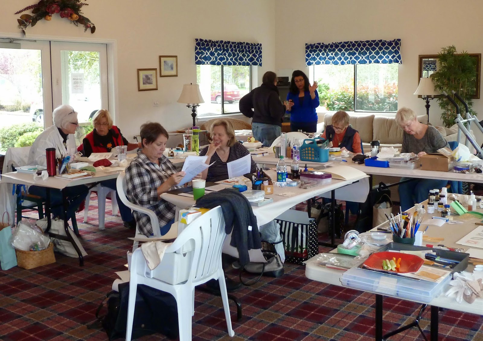
 With the crispness and
smell of Fall newly in the air, ten Rain Writers gathered October 17-18, 2014, for
a weekend workshop with Georgia Angelopoulos, bringing the warm colors of the
season into our artistic experiments.
Through the earthy colors of the common Greek color palette and a wide
variety of gold leaf, Georgia introduced, “All
Things Greek & Gilded,” an exploration of creating harmony and elegance
in our work.
With the crispness and
smell of Fall newly in the air, ten Rain Writers gathered October 17-18, 2014, for
a weekend workshop with Georgia Angelopoulos, bringing the warm colors of the
season into our artistic experiments.
Through the earthy colors of the common Greek color palette and a wide
variety of gold leaf, Georgia introduced, “All
Things Greek & Gilded,” an exploration of creating harmony and elegance
in our work.
Georgia is from a family
of painters, who painted Byzantine churches in Greece. Her heritage proudly influences her work,
inspiring the lettering, colors, and motifs she often chooses. The extensive notes she provided covered
everything from basic color wheel information, to the historic origins of some
pigments, to photographic samples of ancient mosaics and gold artifacts to
inspire our imaginations.


Georgia does not travel
lightly, a result of her passion and desire to share all she can with
her students. Early on the first day, we
were taken on a natural history tour of color—naturally occurring pigments in
stone and ground form, as well as the convenient ‘ready-made’ colors in tubes
of gouache and watercolor that we commonly use. Displayed in groupings of reds, blues, yellows, greens, blacks and
whites, Georgia shared her knowledge of what some of these pigments are derived
from. For example, white can be made from
ground shells, bone, or chalk; blue may come from Lapis Lazuli; green from
Malachite; and black from burned grapevines, soot, or Jet stone. But I found an even more fascinating aspect
to be the representative meaning of certain colors to ancient cultures—turquoise
represented joy to the ancient Egyptians, and blue was considered a divine or
spiritual color. Georgia’s interest in
this area of her art was shared with enthusiasm, along with at least one book
recommendation for our own further studies—Color:
A Natural History of the Palette, by Victoria Finlay.
The typical ancient
Greek tetrachrome palette (four color palette) consists of Yellow Ochre, Red
Earth, black and white. Sometimes added
to this basic palette were blues, greens and purples. Adding gold or Palladium
(silver color) to these already gorgeous pigments creates a rich array of
possibility for our work today, just as it did for the ancient Greeks and
Egyptians.
 Our first task was to
create a “gold sampler” chart on acetate that would later aid our gold
selection for combination with certain pigments. Our focus was flat gilding on paper using
transfer/patent gold leaf, as opposed to raised gilding with gesso and loose
leaf gold. A major factor that took away
all intimidation was the use of a gilding size called Ormoline, an acrylic based medium that gives wonderful results. Georgia provided a wide range of gold leaf so
we could readily see the range of available colors—who knew there were so many
different golds?
Our first task was to
create a “gold sampler” chart on acetate that would later aid our gold
selection for combination with certain pigments. Our focus was flat gilding on paper using
transfer/patent gold leaf, as opposed to raised gilding with gesso and loose
leaf gold. A major factor that took away
all intimidation was the use of a gilding size called Ormoline, an acrylic based medium that gives wonderful results. Georgia provided a wide range of gold leaf so
we could readily see the range of available colors—who knew there were so many
different golds?
Each sample was gilded
in a leaf shape onto heavy watercolor paper, cut out, and taped to a sheet of
acetate. The color of the gold and its
karat weight was then labeled.

Georgia also introduced two other gilding mediums— Water Gold Size, which will dry slightly raised
rather than flat (great for accent “dots” of raised gold), and Kolner Miniatum
Ink, a gilding size that flows well through a pen, particularly a pointed pen
nib for gilding Copperplate lettering.
All of these mediums are available from John Neal.
Interspersed with our
gilding chart task were color mixing exercises, based on the tetrachrome
palette model of two colors, black and white.
Working in two inch squares with a 1/16” flat brush, we created mosaic
designs, fashioned around a blank area to accentuate with our gold of choice later in the day. Exercise one began with our choice of two
colors (I chose Yellow Ochre and Venetian Red).
In addition to the two pure colors, we mixed approximately four “in between”
colors, gradually moving from one pure color to the next. In the next two inch square, we created a tint—one of our selected colors mixed
gradually with white, again moving from one pure color to the next. Square number three displayed a shade—our selected color mixed gradually
with black, moving from one color to the next.
Tones, one color plus grey,
and a black and white mix were also suggested exercises for color gradation
mixes.


As I
mentioned we painted a mosaic design around an empty space left for gold. This is where those fabulous acetate-backed
gold samples came into play…the clear backing of the acetate allowed us to lay
a gold sample directly next to our painted mosaics and select the most
appropriate gold (or Palladium) for our color motif. Brilliant!
 |
| Georgia keeps a swatch book of gold on various papers |
As with any great
workshop,
there was a lot of discussion about other products and questions we
may encounter in our own work. A
valuable bit of information I gleaned was the difference between metal based
pigments, such as TroCol powders by Schminke, and mica based pigments, such as
FineTec watercolors. Metal based
pigments will tarnish over time, losing the initial luster that was once so
beautiful. However, mica pigments will
retain their lovely shine. The tarnishing
of metal based pigments can be avoided with a little extra effort, which led to
Georgia’s next demonstration—making glair.
 |
| "Cooking School 101"...separating the yolk from the white |
Anyone walking into our
classroom at this point might have thought we were making a dessert instead of
gilding! Natural products once again,
drawn from ancient practices, provide the remedy. Glair is made from egg white beaten to a
meringue consistency. When allowed to
sit overnight, refrigerated, the resulting liquid that separates from the foamy
meringue is glair, a natural binder and sealer that can be painted onto
pigments to prevent tarnishing and seal the color.

As if gold isn’t
beautiful enough already, Georgia shared a “tooling” technique that adds even
more interest to a gilded surface. Using
a fairly sharp tool (such as embroidery needle or tack) against a thin piece of
clear film (acetate or Clear Bags—packaging for greeting cards) placed over the
gilded area, a design can be traced into the gold surface. The following beautiful samples are by RW member Judi Brick...


 | ||||
| debossed around the outer edge of gold |
Another very effective practice is “debossing” the edges of the gilded area. With a thin piece of acetate or Clear Bag cello placed over the gold to protect it, outline the outer edges of the gilded design with a ball-tip burnishing tool. This presses the paper down around the gold, creating a slight ‘bevel’ that makes the design area pop up and a chance of better light reflection on the gold.
 |
| wispy effect of the comb brush |
One final demonstration was using a “comb” brush. The irregular length bristles create a wispy effect when pigment is brushed on with this brush when ‘dry’ (little moisture on the bristles or in the pigment). The resulting white areas can then be gilded.
 |
| making transfer/patent gold |
 |
| an enthusiastic group |
When we choose to take a
workshop, it is generally with the intent of learning a specific skill— in this
case, gilding and color mixing. But the
evidence of Georgia’s fabulous instruction is what lies in the bigger picture
of what she taught us, summed up in one word—Harmony. My most eye-opening takeaway from this
workshop was the practice of creating harmony in our work through the use of
color—from choosing the “right gold” based on its warm or cool qualities when paired
with various pigments, to limiting our palette to four basic colors. This sense of limiting was actually very freeing,
in the knowledge that we can’t go wrong when working with two pure colors plus
black and white. With this idea in mind,
one of my favorite tips from Georgia was to mix the colors we are using with
each other: “When writing with black and
red ink…mix a little of each into the other to make them relate more.” The idea is staggeringly simple and the results
so very effective in creating harmony.
Georgia’s masterful
teaching took a topic that usually feels unapproachable and made it attainable
for everyone. Her sense of humor and
warmth, and obvious passion for her work created an inspiring weekend with
ideas that will carry on for further experiments. Here is what a few members who attended had
to say about the workshop…
"This is the second time I have studied under Georgia. I was so impressed the first time I had a gilding workshop with her that I was determined to have her come and inspire our guild with her amazing skills. Again, she did not disappoint—the workshop was filled with "golden" laughter and color all around....most students (to include myself) did not want to go home, but wanted to keep working. Even newer calligraphers in our guild were producing beautiful work—Georgia made it fun and easy. Georgia not only brought a golden light into our calligraphic world but also became a wonderful friend......thank you Georgia!" —Suzie Beringer
"This is the second time I have studied under Georgia. I was so impressed the first time I had a gilding workshop with her that I was determined to have her come and inspire our guild with her amazing skills. Again, she did not disappoint—the workshop was filled with "golden" laughter and color all around....most students (to include myself) did not want to go home, but wanted to keep working. Even newer calligraphers in our guild were producing beautiful work—Georgia made it fun and easy. Georgia not only brought a golden light into our calligraphic world but also became a wonderful friend......thank you Georgia!" —Suzie Beringer
“To
the uninitiated, gilding, like Roman caps, is very intimidating. But once you
receive great instruction and follow those instructions, it can be done. Like
most everything associated with calligraphy it is a process requiring attention
to detail and practice. It is so much fun and adds one more exciting element to
your work. One can be as formal or informal with it as one likes. It is an
extremely versatile medium and can be used very simply or taken to great
heights. Loved every
minute...would have stayed all night !!”
— Judi Brick
“My first experience with gilding was much more than I
expected. Georgia was such a great teacher. I learned so much and
left on Sunday afternoon craving more!”
—Karen Clark
“I found something I loved to do—tooling! I will be continuing with that part of the
class and will be even more inspired by the tooling samples Georgia showed
us. It was wonderful for her to give us
so much information, and I know I will be using parts of it even in my Chinese
writing. So much of Georgia's information was useful for me and I
came out of the class exhausted but excited to try the new techniques I had
learned that I could put to use.”
—Pat
Padden
“I’ve been a student of color for years now, and there’s
always something fun to learn:
Add a dab of one color on your palette to another (and
vice-versa); it makes them work together better. Blowing through the ‘tube’ to moisten the
size and tooling the applied gold were unexpected and fun. Going way back to the roots of gilding
and rudimentary pounded rocks for colors and seeing for ourselves how well the ‘ancient
Greek Tetrachrome Palette’ worked was ... shivery. The whole workshop was enlightening and
developing some rudimentary skills was inspiration to continue.” —Judy Roloson
“I thoroughly enjoyed the
workshop taught by Georgia. She has a gift of being able to teach beginning
students and advanced students in the same setting. She had some wonderful tips
and tricks! One of the tips that I know I will use is mixing colors in your
calligraphy piece so that they harmonize.”
—Linda Duralia
“I
have a new-found respect for gouache as I heard Georgia say that she prefers
gouache over ink at times. The gouache info probably was one of my
favorite takeaways from our class. I would also like to add that Georgia
was able to teach all of us who have such a varying range of abilities and
interests. Her kindness, generosity and knowledge made the gilding class
truly a special experience. I am practicing my lettering like a fiend now
so that I can begin to play with gold adornments. Fun!” —Barbara Carter
 |
| Rain Writers' ray of sunshine, Suzie Beringer |
A huge thank you to Georgia Angelopoulos for a fantastic workshop, and to our Rain Writers Workshop Chair, Suzie Beringer, for all her hard work in bringing us this great experience!!
Respectfully, Christy Schroeder